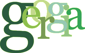
Georgia, Carter's new screen serif, is perhaps an even more remakrable feat than Verdana. It takes the complexity of serifed characters and maske them not only comfortable on-screen, bur also very attractive.
In large sizes, Georgia might be mistaken for a heavier Times New Roman. It's a sturdy face that could easily be used by any newspaper. On-screen in body text sizes, it takes on new life —looking friendlier, almost like Cheltenham.
The characters are beautifully clear at 8-12 points. It's x-height is larger that Times, but not as large as Verdana's, and the result is a face with a traditional feel that's very pleasant on-screen. It has a true italic that is so fluid and graceful it could be used by itself, and like Verdana, a bold that verges on ultra-bold. The numerals have a slightly old-style feeling but are still lining.
Georgia is nothing short of wonderful on-screen — which is, of course, the whole point. It could easily become the de facto serif screen face, and readers would be all the better for it.
ABCDEFGHIJKLMNOPQRSTUVWXYZ abcdefghijklmnopqrstuvwxyz 0123456789